Brand kit
The Chord mark, logo, colors, type and images. Everything here is drawn from the same few parts: strings for orders, a bridge for the price.
Logo
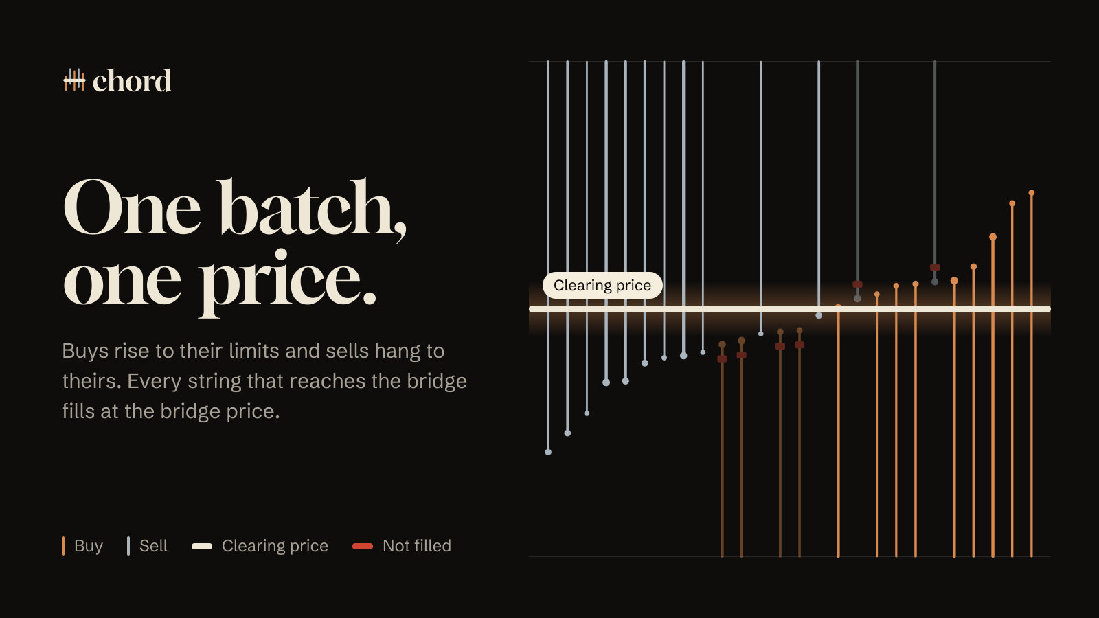
Buys rise from below to their limits, sells hang from above to theirs, and one bridge crosses all of them. The mark is the app’s stage, reduced to five strings.


Color
A concert hall at night: lacquer and ivory, with copper and steel for the two sides of every trade. Paper and ink are the printed programme, used for the docs. Click a color to copy it.
Type
Three faces, each with one job. All three are free under the SIL Open Font License.
One batch, one price.
Approve once, then sign each order for free.
142.20 · 8.4734 SOL · DosE…T2od
Images
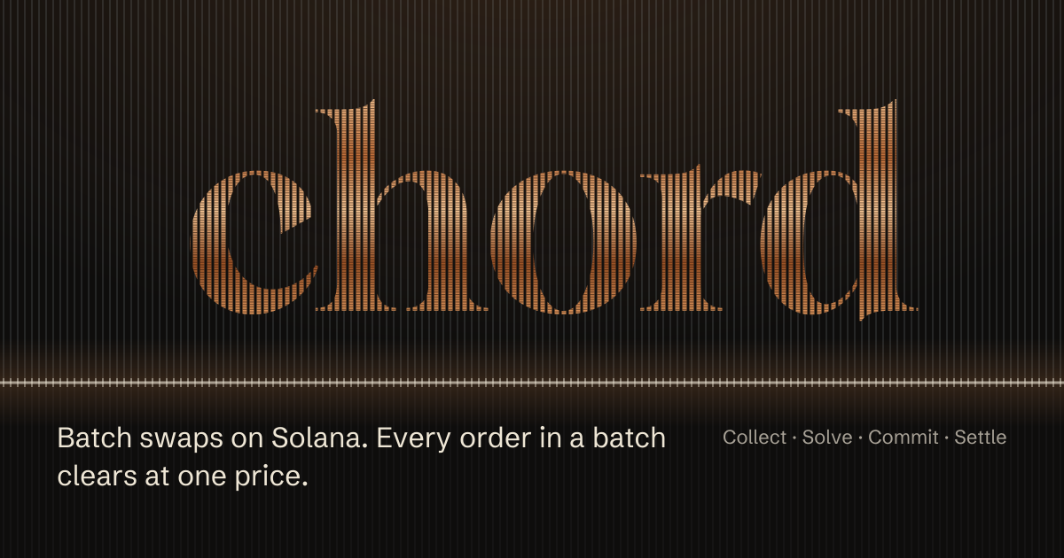
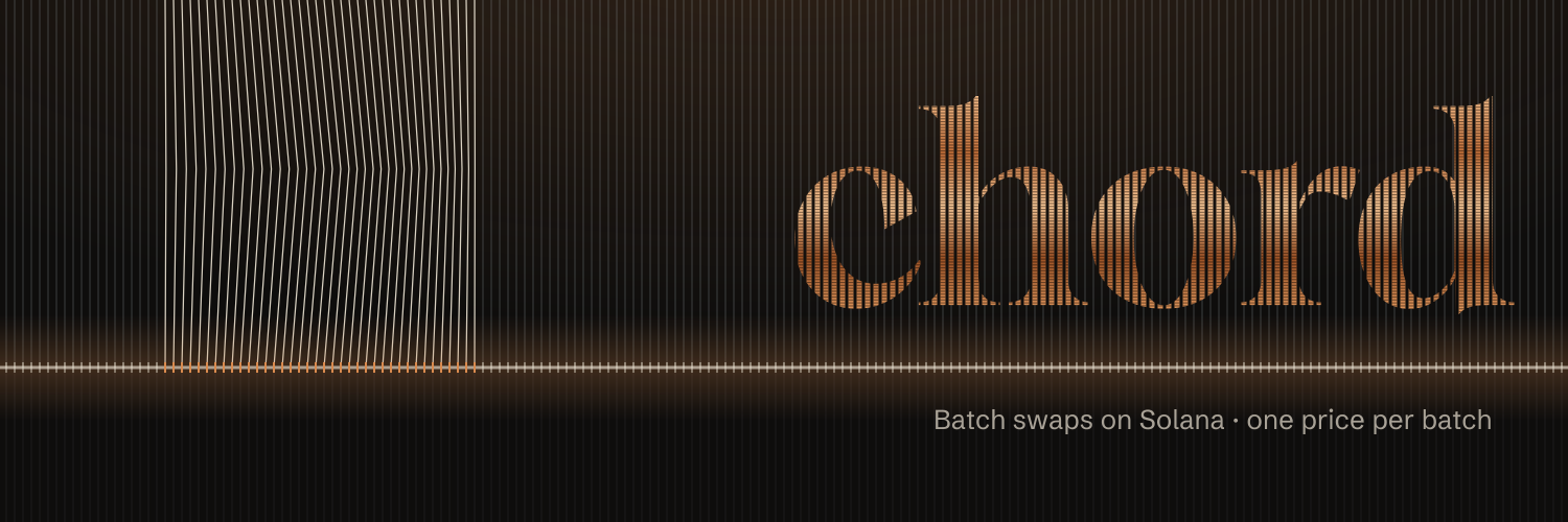
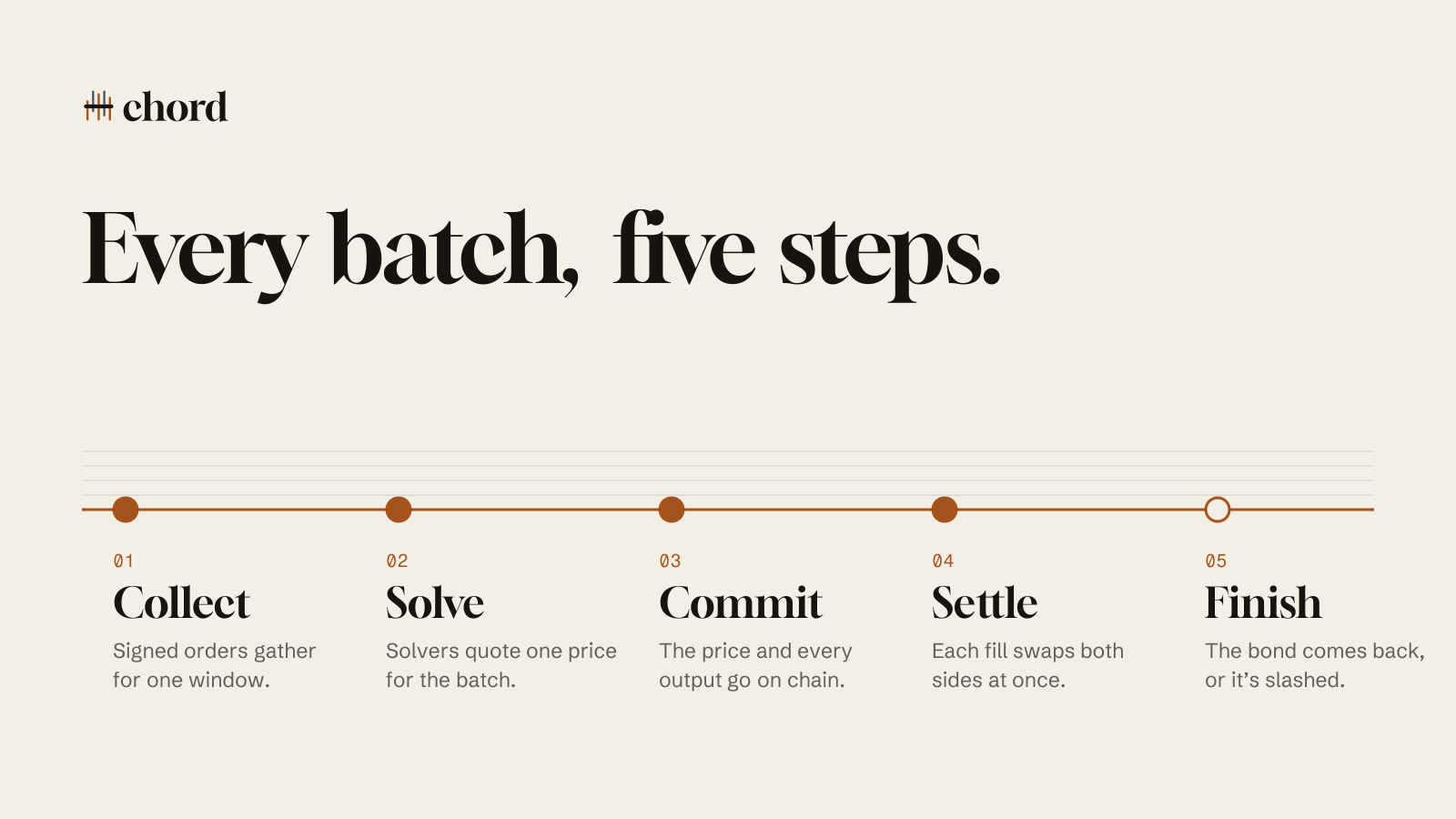
Composed from the same parts as the site: the string field with the wordmark wound in copper, the stage’s strings and bridge, and the printed score. They show how Chord works, not live prices.



Use
4 vector files and 6 images. A few rules keep them reading as one instrument.
- Keep the bridge level.The bridge is the price. Never tilt it, curve it, or let it stop short of the strings.
- Copper buys, steel sells.Don’t swap them, and don’t introduce a third string color. Felt only ever means not filled.
- Give it room.Leave clear space around the logo at least as wide as the mark itself.
- Use the files.The wordmark is outlined from Gloock. Don’t retype it, stretch it, or set it in another face.